
Revealing the Secret of Tiffany & Co. Branding
May 29, 2026
A small blue box sits on a white tablecloth.
No one has opened it yet. The white ribbon is still tied in a perfect bow. But someone across the room already knows what kind of moment is happening. Someone is being celebrated. Someone is being chosen.
Everyone has seen this kind of moment, even if they have never been Tiffany's customer before. The restaurant gets a little quieter. The person receiving the gift smiles before they know what is inside.
That is the power of Tiffany & Co. branding.
Tiffany does not just sell jewelry. Quality isn't even questioned. It sells a moment that people recognize even before the shining Tiffany diamond appears.
That is why Tiffany is different from any other luxury jewelry brand. A private gift becomes a public signal. The blue box turns love and celebration into something everyone in the room understands without a single word. An emotion that touches everyone's hearts. Real beauty.
Tiffany crafted a brand where the box, the color, the ribbon, and the reveal all carry emotional weight, marking a journey into what becomes a forever memory.
What makes Tiffany & Co. Branding Instantly Recognizable
Tiffany & Co. branding: recognition that needs no explanation.
Charles Lewis Tiffany founded the business in New York City in 1837, originally as a stationery and fancy goods store on Broadway. He understood that fine jewelry needed more than craftsmanship. It needed a world people could belong to. It needed to become a heritage.
Tiffany has kept its identity for nearly two centuries: the blue box. The white ribbon. The elegant silver Tiffany & Co. logo.
The specific shade is called Tiffany Blue, a pale robin's-egg color Pantone registered for the brand. No other company is allowed to use it. That means every time anyone sees that color anywhere in the world, only one brand comes to mind.
Most companies refresh their look every few years, but not Tiffany. Because of that, nearly 200 years of gifting, proposals, anniversaries, and celebrations are all tied to that shade of blue.
That is not just branding. That is cultural conditioning.
Tiffany Sells the Moment Before the Product
The strongest part of Tiffany & Co. branding is not the diamond. It is the joy on people's faces before the diamond appears.
The bag enters the room. The person receiving the gift starts reacting before they even know what is inside. Their eyes go wide. Their hands go to their mouth.
The packaging is the first act of experience. Studies show that packaging directly shapes how a person perceives the value of what is inside, and Tiffany knew that since 1853.
This is why a Tiffany gift feels bigger than diamond necklaces, earrings, watches, or an engagement ring. It arrives with a built-in story.
How the Blue Box became a Social Signal
The blue box makes private emotion visible to everyone.
A proposal at a restaurant. A birthday surprise. A graduation gift after years of hard work. A self-gift after a hard season. An apology. A holiday morning. An anniversary. In every moment, the blue box changes the scene.
It does not tell what happened or why the gift is being given. But it signals effort. It signals love. It signals a milestone that someone decided was worth marking.
Color psychology research shows that color accounts for up to 90% of a product's first impression. Tiffany made color itself a form of communication.
Tiffany blue does not scream. It quietly announces.
This thinking goes all the way to the jewelry itself. The Tiffany Knot collection is a perfect example. Inspired by the idea that love is an unwavering bond, the knot turns a piece of jewelry into something people understand. A knot is enduring. That inspiration of love came from something every person already carries inside them. That is how Tiffany & Co. branding works at every level, from the blue box down to a single design.
Cartier's red box and Tiffany's blue box are two jewelry packages people recognize without a logo. The difference is that Tiffany's color is legally protected. Cartier's is not. That changed everything. Tiffany Blue does not just compete with other jewelry brands. It has become a standard that crosses industries, the same way a red Louboutin sole or a Burberry plaid signals the brand's world.
The blue box is now an icon worldwide. It carries more meaning than any written description. The image has been imprinted into the world's visual memory. Most brands use color to stand out on a shelf. Tiffany uses color to speak an entire language.
Why Tiffany Turns Gifting into a Performance
Tiffany does not treat gifting like a transaction. It treats it like magic.
Tiffany's blue box feels like a ceremony. Ceremony means audience. A ceremony means people will remember.
The bag enters the room. The box lands on the table. The ribbon slows the surprise down. Even people in any public setting who have nothing to do with the moment stop and watch. Tiffany designed the reveal to be visible.
Before TikTok unboxings became a trend, Tiffany already understood that a great reveal is worth sharing. This is also why Tiffany thrives on social media without trying. A blue box on an Instagram story already says enough.
Tiffany not only designs jewelry. It designs the memory of receiving it.
When the Brand Becomes the Destination
Most brands sell a product and hope people remember the experience. Tiffany flipped that completely.
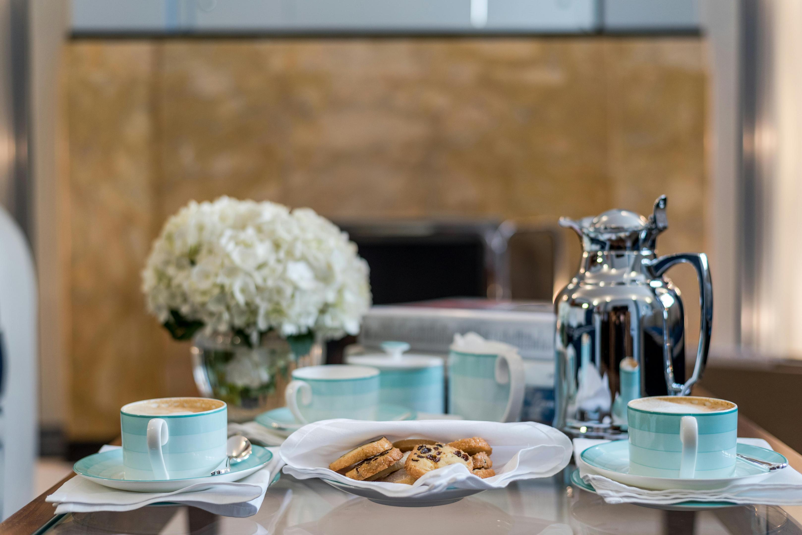
In 2017, Tiffany opened the Blue Box Cafe on the fourth floor of its Fifth Avenue flagship store in New York City. The cafe turned Tiffany into a destination anyone could visit to experience the world of the brand.
People fought for reservations. The food was good, but that was not why people were going. They were going to say that they had Breakfast at Tiffany's. They were going because being inside a Tiffany space itself is a signal.
Tiffany then took the concept global. The Blue Box Cafe in Tokyo's Ginza flagship featured desserts by Japanese chef Natsuko Shoji, known for her jewel-like creations.
This is Tiffany & Co. branding. The brand itself is the destination. People are buying access to the feeling of being inside the Tiffany world, not just the ability to carry a piece of it.
Every Tiffany Celebrity Campaign Expands the Meaning of Love
Tiffany's most famous moment was not planned. In 1961, Audrey Hepburn stood outside the Fifth Avenue flagship in a black dress and pearls at the opening of Breakfast at Tiffany's. She was not paid by the brand. She was not even wearing their jewelry.
But the image locked Tiffany into the global imagination of aspiration. Every campaign since has been building on that.
Tiffany has remained popular for almost two centuries by updating who is allowed to represent it. Every single Tiffany campaign since the LVMH acquisition has been about love. Not the same love, but a different kind every single time. That is a strategy.
After LVMH completed its acquisition of Tiffany in 2021, the brand started expanding what love could mean and who it could belong to.
The "About Love" campaign, featuring Beyoncé and Jay-Z, redefined love as a legacy and a source of power. The press coverage was immediate. The campaign generated headlines across fashion, culture, and business media. Beyoncé was shown wearing a 128-carat Tiffany Yellow Diamond, giving the message that love is ambitious and generational.

Then, Rosé of BlackPink expanded love to be a global style, attracting a younger crowd. She defined love as something that does not need an occasion. Then, the 2025 holiday campaign with Anya Taylor-Joy followed the white satin ribbon around the world. The campaign explored romantic, familial, and self-love.
This year, Tiffany chose Natalie Portman as the face of their campaign. Debuting at the 2026 Academy Awards, it follows Portman through a single day as an actress, producer, and mother.
It ends with a letter to her daughter, a message about inner strength, imperfection, and the kind of love that asks nothing in return. "Inner strength isn't found. You build it, piece by piece," she says, "This is where inner strength grows best.
And that's where you'll find love. The love for yourself. With love, Mom." A version of the song Moon River plays, a reference to Audrey Hepburn and the 1961 film Breakfast at Tiffany's.
Tiffany has systematically expanded the definition of love, so the blue box can belong to every kind of milestone: Romantic love. Familial love. Self-love. Generational love. Love as strength. Love as identity.
Every definition is a new reason for the blue box to appear on a table somewhere in the world. Tiffany stays. The meaning of love is forever growing.
Most brands either stay so classic that they feel irrelevant to certain crowds, or they chase trends that they lose meaning. This balance is hard. Tiffany can keep pushing and expanding.

What Marketers Can Learn from Tiffany & Co. Branding
The lesson is not "pick a nice color and keep it forever."
The real lesson is to build something people understand without explanation and then protect it.
Most marketers think about brand identity as a color and logo. But Tiffany's advertising has never led with the product. Every ad leads with a feeling.
Tiffany reframes what brand identity actually means. It is not just what something looks like. It is about what people feel the instant they recognize it. It is the story that plays in their head.
Three things worth taking:
-
Make the brand recognizable fast. People decide in seconds. A brand cue needs to land before the brain even has time to process it. Tiffany Blue does that without a single word.
-
Build emotion before selling the product. The blue box creates anticipation and significance before anyone sees the jewelry. The feeling comes first. The product confirms it. Any brand can apply this by thinking about what a customer feels before they even open the package.
-
Protect the messaging. Tiffany & Co. branding has evolved through celebrity campaigns and new collections. Every campaign looks different, but every campaign is about love. That consistency is what makes expansion possible without losing the original meaning.
Chanel has done it with the interlocking C. Hermès has done it with the orange box. But neither color is legally protected.
Other jewelry brands need the product to prove its value. Tiffany proves it before the box is even opened. That untouchability is the goal.
The Blue Box is the Story
Back at that restaurant table, the box is still closed. The ribbon is still tied. But the dream has begun.
That is the secret for how Tiffany & Co. branding thrives. It does not sell a product first. Tiffany continues because it sells the feeling that something important is going to happen. A moment that will last a lifetime. It has held together for nearly 200 years: a trademarked color, a packaging ceremony, and campaigns that keep redefining what love means. Every piece works together.
One shade of blue. One small box. And somehow, Tiffany is a language that the whole world speaks.
Apple does something similar now with its white box and magnetic closure. But Tiffany built this blueprint first. In a crowded luxury industry, this recognition is hard to replicate.
The next time a brand makes someone feel something before the product is even seen, that is Tiffany's blueprint. For marketers and brand builders, that is a standard worth studying.
🪽 Written by Richelle Chang
join 50k marketing girlies
Private Marketing Girly LinkedIn Group
A private community where young women in marketing network, collaborate, and support each other.