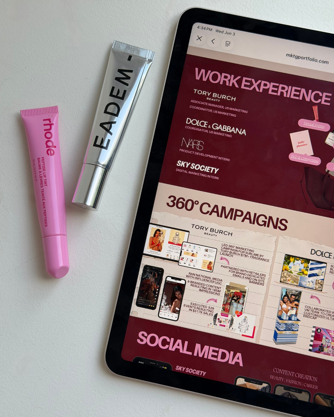

Reason How to Best Use Color Theory for Branding
May 29, 2026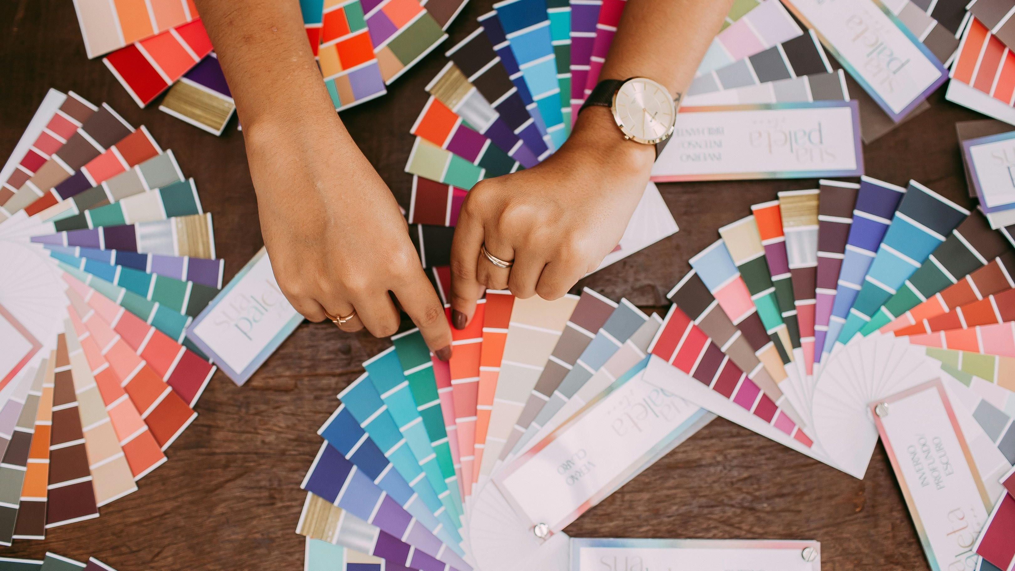
The Untapped Power of Personal Color Harmony in Branding
Color choice is an influential decision that can change the identity of a brand. When brands are deciding their visual identity, they need to consider a few things.
What are the current trends? How does it compare to other competing brands' visuals? How does a brand integrate the personal color preferences of an individual or a group? Brands that develop a cohesive look can have a lasting effect through color selection rather than marketing alone.
Meanwhile, color season analysis was first introduced as an online trend. Analyzing different colors and seasonal tones that complement a person's natural features.
This analysis results in specific colors or tones that better inform style choices. Such as shopping for wardrobe pieces, beauty products, and beauty habits.
There is untapped potential in these same decisions in color theory for branding. Informing individuals to find colors that suit their personal brand through color psychology. Elevating their image across multiple platforms with clarity, consistency, and harmony.
The Core of Color Season Analysis
Color Season Analysis is a powerful tool based on how an individual's natural features interact with specific groups of colors. It is a system that sorts into specific color wheel palettes based on the four seasons.
It begins by looking closely at natural features such as skin undertone, skin color temperature, and the contrast between feature colors. Color predictions based on how colors visually affect an individual's appearance guide an individual to the color combinations and specific hues that elevate their presence.
Season analysis establishes a group of colors that balance with an individual's features in a positive response. The analysis applies to wardrobe, beauty, and hair choices that complement a person.
It also identifies multiple colors on the color wheel that may clash with a person's features, leading to negative associations. The outcome brings a coordinated visual presence into everyday life.
Let's connect this same way of thinking to marketing with color theory for branding. When people use the colors that elevate their natural traits, they are enhancing their appearance.
For brands, that means having an intentional color scheme appearing across different platforms. Using this approach creates a personal brand with its own unique color family and brand presence.
How Color Psychology has Classically Shaped Brand Colors
Color psychology serves as a way for many brands to develop their visual identity. It helps to see how they visually communicate with their audience. Brands influence which emotional responses, thinking, and tones are communicated with specific color palettes.
The effect can range from feeling peaceful, bold, luxurious, dependable, and more. Color psychology serves as the groundwork for developing a company's marketing presence. The goal in using color theory for branding is to enhance a brand's core values, message, and identity.
At its core, applying consistent color groups reminds people of a brand's personality. Potential customers and clients can recognize and remember the company across multiple outlets.
Using color theory to determine palettes from the color wheel is important throughout a company's appearance and to maintain consistency. Companies or brands with a clear visual identity across their social media, websites, and logos establish a presence that is consistent and authentic.
Guiding Brand Personality Decisions through Seasonal Insights
It can be overwhelming to choose colors that define a brand's nature. Almost like walking into a large clothing store with hundreds of outfits to choose from. Instead, start with the predetermined color season palettes to narrow down the options.
A person's color analysis reveals their season of hues, which harmonize with their natural features and characteristics. Brands can also use the same guidance to help focus their decision making process, like color psychology . A curated palette from the natural world informs marketing choices, making them more refined, transparent, and deliberate.

When season analysis started trending, the physical color palettes were designed to readily show color balance and harmony.
Naturally, the chosen colors will work together on any media platform. Having this built in hack can help brand identity, even if the brand is you as a professional! Discovering the ideal color season for an individual is effective in personal branding. It becomes a framework for color theory in branding, which is built and defined.
Elevating Brand Recognition with Seasonal Color Palette Alignment
Alignment through color theory for branding creates a powerful impression through their natural palette. When individuals choose to dress in their season, features appear brighter, balanced, and vibrant overall. The same perspective can be carried over into portfolios or many businesses for memorability.
Individuals want to be able to stand out with consistent visuals and color usage, utilizing graphics, headshots, and other layout elements, conveying a polished impression.
This concept can also inspire confidence for an individual as well, knowing that their alignment allows them to shine. Social media can also benefit from this design between thumbnails, posts, and banners in efforts to seamlessly connect platforms together.
Using color psychology, audiences will be able to associate the curated color scheme quickly for an individual as well as a company.
Continuity between brand colors, social media visuals, and chosen wardrobe can reduce the amount of visual noise caused by misalignment.
Marketing science allows this intentional sequence to create a supportive and confident brand personality that invokes unity from any first impression to all target audiences moving forward.
Shining with a More Aligned and Authentic Brand Identity
Successful brands that align their chosen colors display intentionality while maintaining authenticity. People building those brands can use this intuitive approach in development to maintain consistency in visual identity and naturally showcase their features at once.
Blending these design choices with what creates a natural color harmony in personal branding can be seen as a stylistic strategy that feels both real and refined.
Exploring what color season best suits you as an individual can be a pivotal step in better understanding how to stand out amongst an overwhelming market.
Taking the time to apply these insights across your brand colors, wardrobe, and digital media presence can inspire true authenticity through color theory for branding.
When various aspects work together in visual harmony, your personal brand can shine with memorability and inspire pure aspiration.
Intentionally going the extra mile in having these aspects of your professional and personal appearance can help you leave an eye catching impression and identify opportunities down the road!
🪽 Written by Alissandra (Ali) Celia
join 50k marketing girlies
Private Marketing Girly LinkedIn Group
A private community where young women in marketing network, collaborate, and support each other.